MapDashboard WebApp custom component development guide |
Each visual component displayed in the component panel of the MapDashboard WebApp corresponds to a Functional Component class at the code level. For those Functional Components which support visual modification of properties in the property panel, they also have a Property Component class. You can decide whether to include only a Functional Component or both of them in a custom component according to your business needs.
Before the development, please install Git and Node.js in your machine. And install a Vue.js editor, such as HBuilderX or VS Code.
git clone https://github.com/SuperMap/mapdashboard-custom-components
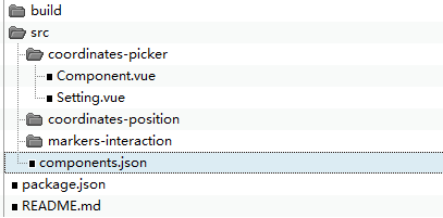
The downloaded project mainly contains the following contents:

In the directory structure:
{
"CoordinatesPicker": {
"name": "Coordinates Picker",
"type": "CoordinatesPicker",
"defaultProps": {
"mode": "mousemove",
"fontSize": 14
},
"uri": "coordinates-picker/Component",
"settingUri": "coordinates-picker/Setting"
}
}
Fields introcution:
| Field | Type | Required or not? | Description |
| name | String | Y | The custom component name displayed in the component panel of the MapDashboard WebApp. |
| type | String | N | The type of the custom component. It must be consistent with the one defined in the Functional Component (Component.vue). |
| defaultProps | Object | N | Default values for the custom component property configuration items. |
| uri | Object | Y | The relative path of the Functional Component (Component.vue). |
| settingUri | String | Y | The relative path of the Property Component (Setting.vue). |
npm install
npm run build
The above command will compile the developed custom component into the corresponding js file. After the compilation process is over, a dist directory will be generated under the project root directory, which contains the js file and a copy of the components.json defined in step 3.
Note: If the extension effect doesn't show in step 7, please refresh the page, or delete the browser cache, and try again.