
Implement a custom component |
This section takes the coordinates-picker in the sample project as an example to introduce the custom component development. Before diving in, please learn about the knowledge of Single File Components and Listening to Child Components Events of Vue.js by yourself.
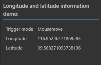
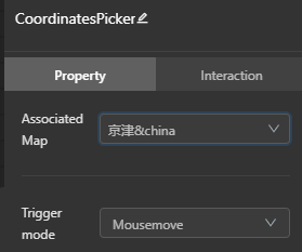
The coordinatesPicker component needs to realize the function of displaying the coordinate information in real time after clicking or moving on the map, as shown in Figure 1. And the trigger mode can be set in the property panel.


Figure 1 Functional Component panel Figure 2 Property Component panel
In the <template></template> tag pair of the newly created Component.vue file, insert the following virtual DOM code:
<template>
<div :style="fontStyle" class="custom-component-container">
<h3 :style="{ color: textColor }">Longitude and latitude information demo:</h3>
<div v-if="lngLat" class="coordinate-holder">
<div class="coordinate-item">
<label>Trigger mode: </label>
<span>{{ optionsList[mode] }}</span>
</div>
<div class="coordinate-item">
<label>Longitude: </label>
<span>{{ lngLat.lng }}</span>
</div>
<div class="coordinate-item">
<label> Latitude: </label>
<span>{{ lngLat.lat }}</span>
</div>
</div>
</div>
</template>
In the <script></script> tag pair, define the component name, properties, data, methods, and events used in the virtual DOM.
The properties and data defined in this example are as follows:
<script>
export default {
name: 'CoordinatesPicker',
props: {
mode: {
type: String,
default: 'mousemove'
},
fontSize: {
type: String,
default: '18px'
},
textColor: {
type: String,
default: '#fff'
},
background: {
type: String,
default: '#333'
}
},
data() {
return {
lngLat: null,
optionsList: {
click: 'Click',
mousemove: 'Mousemove'
},
pointsLen: 5
};
}
};
</script>
In coordinates-picker sample, the interactive behavior of the component needs to be changed according to the event trigger mode set in the property panel, so watch is used in <script></script> to listen for changes of the mode field in props. The code is as follows:
watch: {
mode() {
this.triggerMapEvent();
}
}
The triggerMapEvent() method can add or remove corresponding event listeners on the map component according to whether the value of the monitored mode is mousemove or click.
If the custom component needs to interact with the map component, it is also necessary to implement the loaded(map) and removed(map) methods. The interfaces are described below:
| Interface Name | Type | Parameter | Function Description |
| loaded(map) | Function | map | This method is called when the associated map is loaded. In this method, you can implement map-related interactive operations. |
| removed(map) | Function | map | This method is called before the associated map is destroyed. In this method, the map-related operations need to be cleared, such as: clearing the added layers, removing the listeners added on the map, resetting the map-related variables. |
In the sample, the loaded(map) method adds the mousemove or click events for the associated map, removed(map) method removes the monitored events and sets the related variables to null. The code is as follows:
loaded(map) {
this.map = map;
map.on(this.mode, this.showCoors);
},
removed() {
this.map.off(this.mode, this.showCoors);
this.map = null;
this.lngLat = null;
}
Define the style used by the component DOM in the <style></style> tag pair. For example, the style class used in step 1 is defined as follows:
<style lang="css" scoped>
.custom-component-container {
padding: 8px;
}
h3 {
border-bottom: 2px solid #1890ff;
display: inline-block;
padding-bottom: 6px;
font-weight: 600;
}
.coordinate-holder {
padding: 0 10px;
}
.coordinate-item {
margin: 10px 0;
display: flex;
}
.coordinate-item label {
width: 35%;
}
.coordinate-item span {
flex: 1;
}
</style>
At this point, the code of the Functional Component has been completed. For the complete code, please refer to the example yourself.
If your custom component doesn't need to support the function of setting properties in the property panel, you can skip the implementation of Property Component.
The process of implementation of the Property Component is the same as that of Functional Component. But note, the props object defined in Setting.vue corresponds to the props defined in Component.vue. And each configuration item change needs to distribute ($emit) change event, and the value needs to be passed in the form of key-value pairs. The code is as follows:
<template>
<div class="custom-text-setting">
<div class="sm-setting-panel">
<div class="sm-setting-panel__header">Trigger mode:</div>
<a-select
class="sm-setting-panel__content"
:value="mode"
:options="optionsList"
:getPopupContainer="triggerNode => triggerNode.parentNode"
@change="val => handleChange({ mode: val })"
/>
</div>
<div class="sm-setting-panel">
<div class="sm-setting-panel__header">Font Size:</div>
<div class="sm-setting-panel__content">
<a-input :value="fontSize" @change="e => handleChange({ fontSize: e.target.value })" />
<span class="sm-setting-unit">px</span>
</div>
</div>
</div>
</template>
<script>
export default {
props: {
mode: String,
fontSize: [String, Number],
textColor: String,
background: String
},
data() {
return {
optionsList: [
{
label: 'Click',
value: 'click'
},
{
label: 'Mousemove',
value: 'mousemove'
}
]
};
},
methods: {
handleChange(data) {
this.$emit('change', data);
}
}
};
</script>
The MapDashboard WebApp also provides some basic style attributes for components, such as the sm- prefix style class used by the virtual DOM mentioned in the above code. Below is a detailed introduction:
At this point, the code of the Property Component has been completed. For the complete code, please refer to the example yourself.